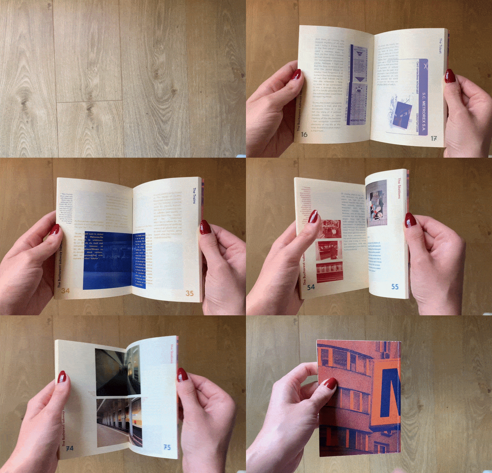
The Bucharest Subway Handbook
A love letter to the Bucharest subway disguised as an analysis of the graphic design elements that can be found around it.


"In a way, the subway is much like a synthesis of the entire city, and maybe that is why I care so much about it. But that is not to say that the subway is not special in its own right. Through this research, I got to take a deep dive into the many aspects of the Bucharest metro that I find are connected to my study of graphic design in one way or another, starting with the most banal object – The Ticket, then moving on to the bigger fish, like The Trains and The Stations."


In its design, the book aims to have a low-cost low-effort look to it, very much inspired by the disposable nature of mass-produced cardboard tickets, while still retaining legibility. Each section functions on a simple 2-color scheme, with the images (in most cases very low in resolution) presented in one color and the text in the other. On a physical level, this came in the form of a pocket-sized book printed on thin, slightly yellow-toned paper that wears its imperfections with pride.


